📱 Mobile Application – New Updates
Here are highlights of our new public beta release available now and following our December update.
Please access these links on your device to join the public beta on Android or iOS (you can install the beta version in TestFlight).
📋 Tasks Board
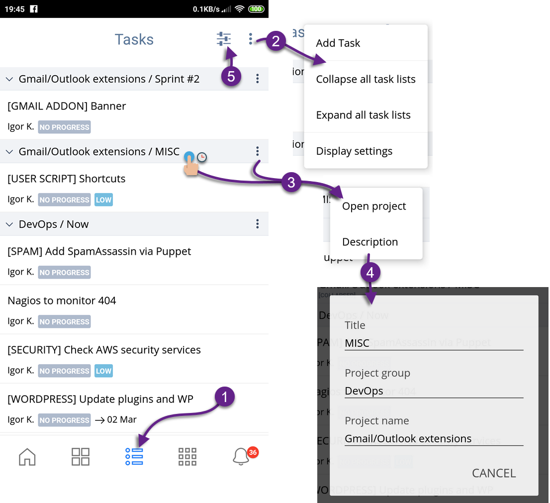
We added the Task Board (1). Added more actions into the actions menu (2). Tap & hold on a task list or accessing a menu […] (3) will allow you to open that project or check a project description, project name and project group name (4). You also have access to filters and sorting on the Task Board (5) including, access to your saved filters you created on any device.
🌳 Subtasks
Double-tap to collapse and expand subtasks (1). When subtasks are collapsed, you will see a visual indicator (2).
We will be adding options to collapse all subtasks in a project, task list as well as on Tasks Board via action menu the next release.
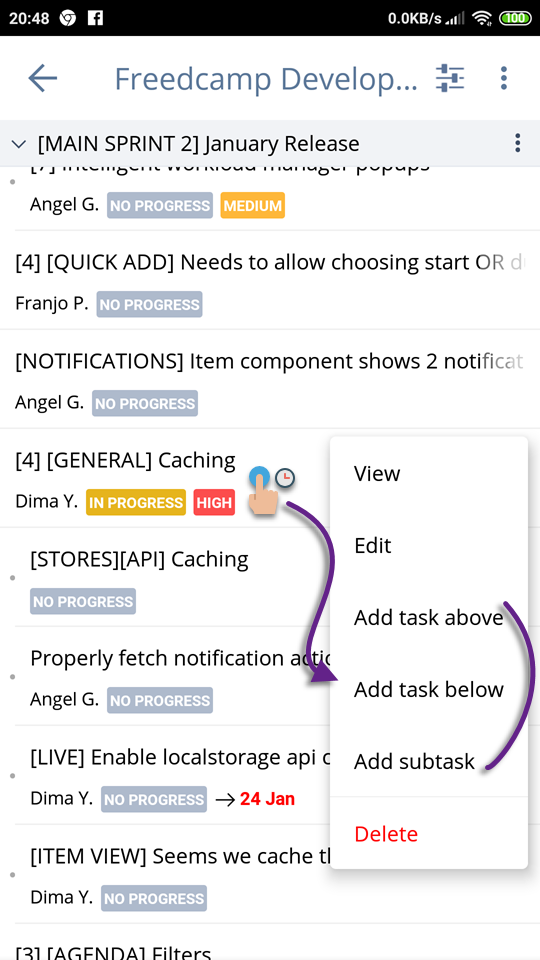
With a tap and hold or swipe left and ‘More Actions’, you can now add task/subtask below or above or create a subtask.
For example, if you tap and hold on a subtask and select ‘Add task above‘ you will add a subtask above this subtask on the same level of the hierarchy.
If you tap and hold on a subtask and select ‘Add Subtask’ you will add a sub-subtask under this subtask.
If you tap and hold on a task and select ‘Add task below’ you will add a new task below this task.
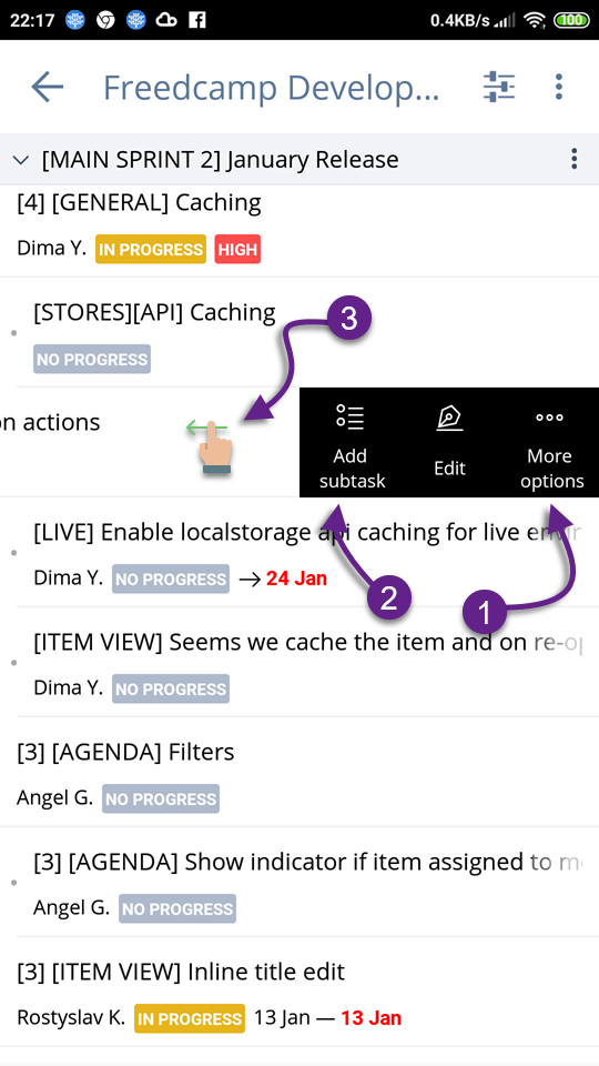
You can also access the action menu (1) and a shortcut to ‘Add subtask’ (2) with the left side swipe (3).
📺 Display Settings
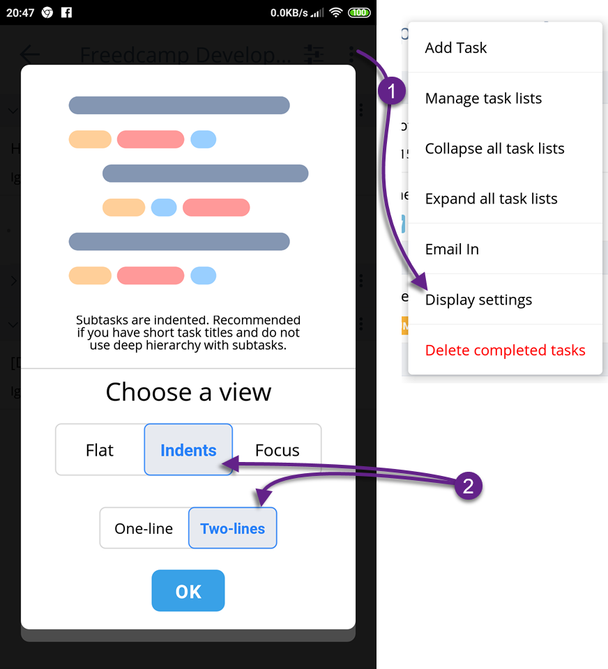
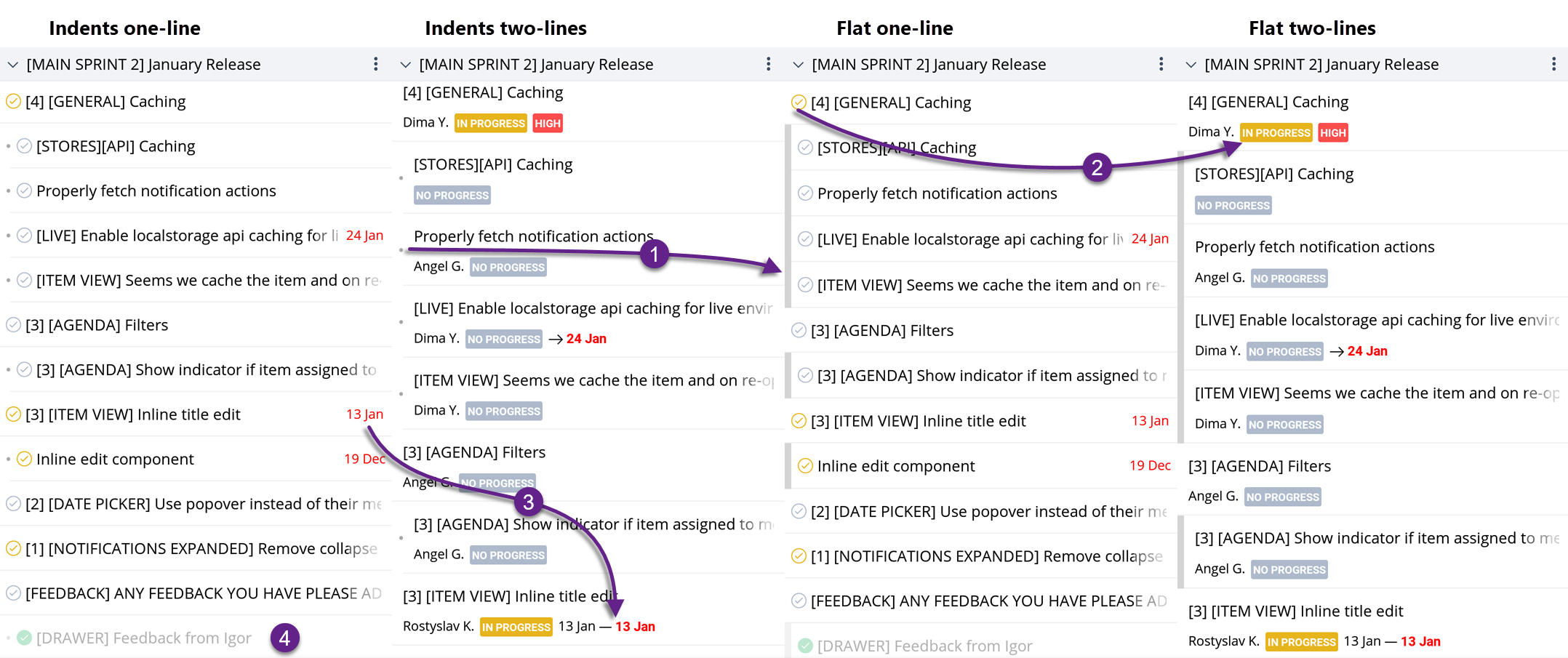
We removed card-based design using two lines and replaced it with four new options (1) – Indented (one or two lines) and Flat (one or two lines). Cards took too much space both vertically and horizontally and only worked fines if you do not use subtasks, and your task titles are very short.
We set the default to be as close as it was with the old cards interface (2) – Indented two lines. These settings are global – once you switch on the Task Board or in a project – that view will be used everywhere in the application to view item lists.
Please note that in one line view tasks status is communicated via an icon color preceding task’s title, in two-line views a label with text is used to give more space for lengthy titles or please those who prefer text labels to icons – see (2) below.
You can see the same subset of tasks compared side by side down below.
One line view will show due date only (in red of overdue) while two-lines view will show both start and due dates if set (3).
(4) is an example of a completed task (the green icon is used in one line view and [COMPLETED] label in two lines view which is filtered out on this page (dimmed out).
The ‘Indents’ view used dots and white space to push subtasks to the right side down the hierarchy while the ‘Flat’ view adds a darker color stripe in front of subtasks (1).
We do plan to use two-lines view more extensively to bring more information such as if a task is recurrent, has dependencies and blocked (or available), part of a milestone, time is tracked in general as well as if it tracked right now and if any new updates are unread.
We plan to add two more brand new views called ‘Focus’ in two flavors – ‘Me’ and ‘Team’. We added hem with descriptions as ‘Coming Soon’ options.
📅 Calendar Board
We updated the Calendar board and also removed cards and start to use all the device width to be able to show more information gradually changing to a unified way to display data in the application.
🔙 Undo
We added ‘UNDO’ action when you delete a task or change a task’s progress status from the tasks view page.
We also added more confirmation dialogues when you delete stuff.
✅ Complete via swipe
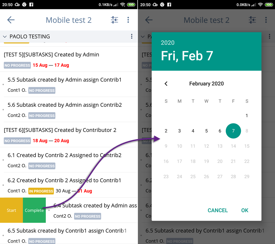
When you complete a task with swipe right – you will be prompted to select a date. Press ‘OK’ to complete with today’s date.
📑 Task List inside a project
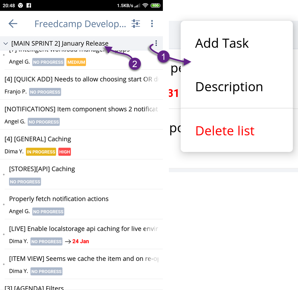
You have access to a task list description from the action menu, as well as an option to delete the task list (1). A task list name conveniently stays on top of the page when you scroll down (2).
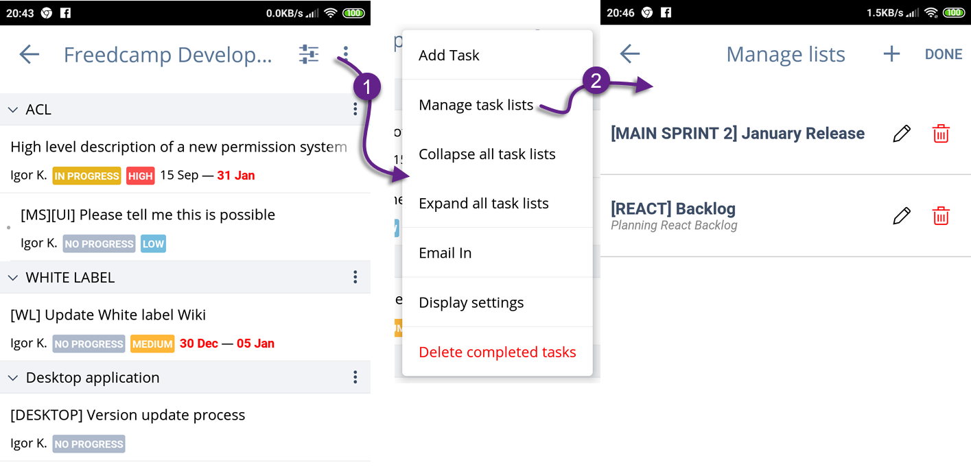
Inside a project, you can expand/collapse all task lists (1) and have access to manage task lists interface to edit, reorder, or delete your lists (2).
📩 Email-In
We also added access to email-in – please see how to access this option above, making it easy to send an email and create a new task with ease.
Now you can use one-click login if you signed up or connected later your Freedcamp account with LinkedIn on mobile.
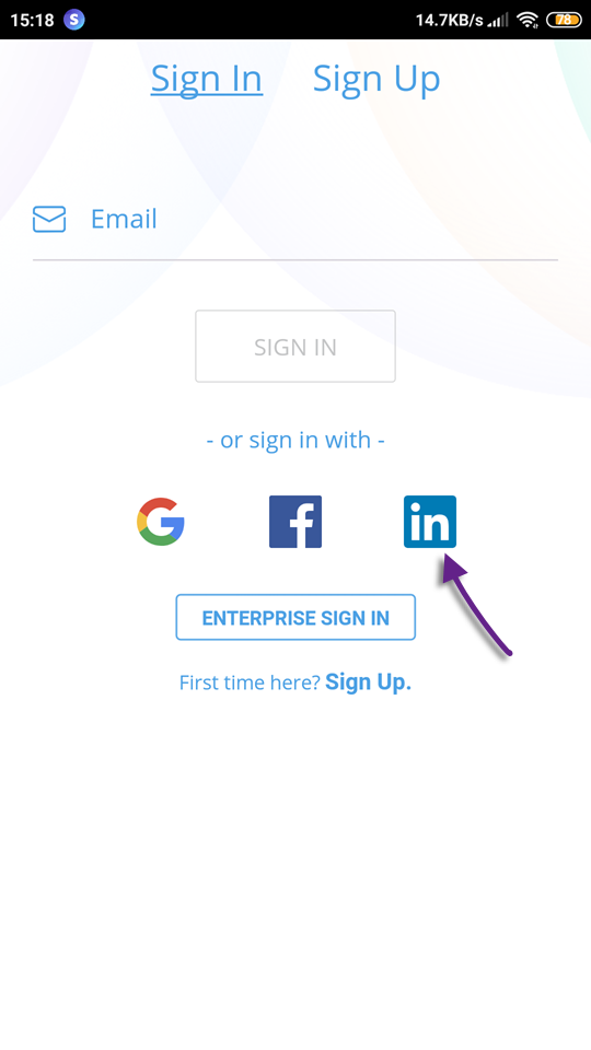
HINT: In Freedcamp you can have your Fredcamp email to be a@b.com while your one-click login can be associated with Gmail via a@gmail.com and Linked in via a.c@b.com.
Typography
We switched to Open Sans font and plan to play with it, potentially keeping it for UI labels and using Roboto font in the future for users entered data display.
We will be experimenting more as some information seems to be too small, and some elements are not getting enough eye attention – we will test different font sizes and use of Semi-Bold Open Sans to make it better.
If you use the Gmail application – it uses Sans Pro (Google proprietary font) for UI and Roboto for user’s data.
What’s next?
Main Goals
- New View/Add/Edit task/subtask interface allowing to update attributes without editing a task (simply tap a due date to change it)
- Adding support for all the attributes we currently do not support – start date, recurrence, custom fields, tags, etc.
Stretch Goals
- Adding 2FA authorization
- Adding options to collapse and expand all subtasks on the Tasks Board, inside a project as well as for a task list everywhere in the interface.
